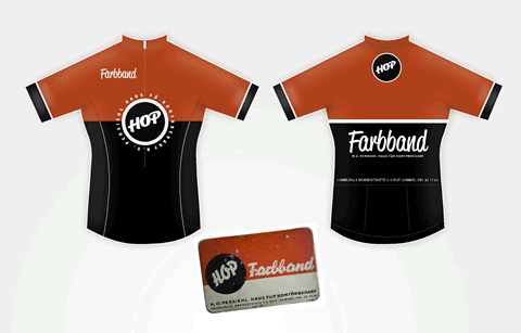
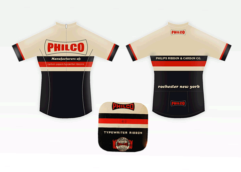
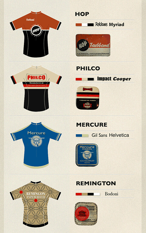
I knew a while back that I'd be doing some cycle tops in 2012. Having never done anything like this before I thought it would be a good idea to try adapting some existing brands onto cycle tops as a bit of a crash course.
Sponsors' logos really do ruin a nicely designed cycle top.
On design sponge I found a link to Uppercase's blog post about the small tins typewriter ribbons were packaged in. I thought the type and colour really lent themselves to some classic cycle tops from the 60s & 70s. All those stripes and slabs of colour were really reminiscent of the Molteni, Brooklyn and Raphael tops before sublimation printing and when they were still made from wool and stitched on lettering.

So I chose 4 or 5 and went in search of a few more as well.

I ended up with about 4 that I though really lent themselves really well.

What I learned? Simple is most definitely better. Bike design seems to be cyclical. It can drift up it's own backside with curves and twists and funny shaped forks but it always comes back home to 2 triangles and nice thin tubes. Cycles tops seem to follow a similar path. Cippolini's tiger suits were a high point or scraped the barrel, either way we've seen a return to more subtle designs of late. I'm not sure it's retro, I just call it cyclical.
The other thing I learned was any more than 2 sponsors logos really does ruin a nice cycle top.
Image credit: inspiration and some imagery taken from Uppercase's Flickr set.