For almost 20 years Liberty Blue has been supplying their customers with completely exclusive fashion. Risk-taking with a real sense of humour and originality.
I'm playing all the right notes sunshine, but not necessarily in the right order…
I've known the owners for years, and they'd asked me a few times to work with them on their on-line store. My time's tight as I'm full time with 3 kids, I have to pick my projects carefully. I don't always pick the best paid job but I try and go for job with legs, something that will continue to evolve over a longer period of time. Exposure is another factor. You could do a well paid job for an archaeological project happening in a boggy field in Derrytresk, but it's not going to generate much traffic or interest. Like water on a stone I eventually gave in.
To be honest I was more interested in working on their brand rather than designing a web site. Their brand consisted of this:
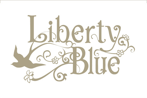 Original Logo
So we sat down for several nights over pots of strange green Japanese tea talking about who Liberty Blue was. I drew up a small questionnaire and asked for about 100 responses. From the feedback in the shop we were able to come up with a concise brand identity and accompanying branding guidelines.
 Branding Document
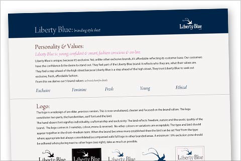 Simple Style Guide
The original logo was hand drawn at some point and scanned. So all we had was the raster version. I always tend to steer clear of trends. The swirls and scrolls had become 'trendy' and I felt they ran the risk of looking out-dated in about 18 months. It looked a bit overgrown and cluttered. They liked the hand drawn font and thought it should stay. I got the hedge clippers out, give it a trim and drew the vectors for the font in Freehand. Rather than redesign, it can be a good idea to simply realign. As the great Eric Morcombe once said, "I'm playing all the right notes sunshine, but not necessarily in the right order". I liked parts of their logo, it had all the right parts but I felt most of them were 'not necessarily in the right order'. I applied the new brand to stationery and bags etc
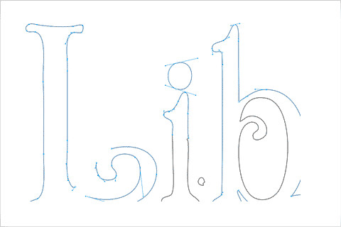 Vectors in Freehand MX
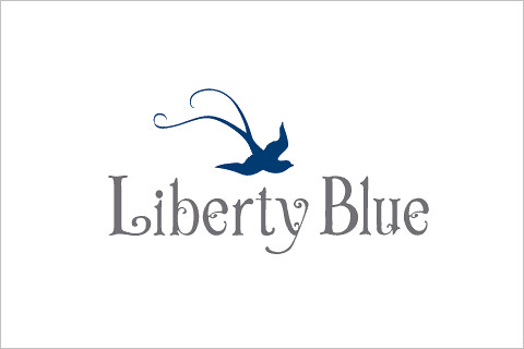 Final logo
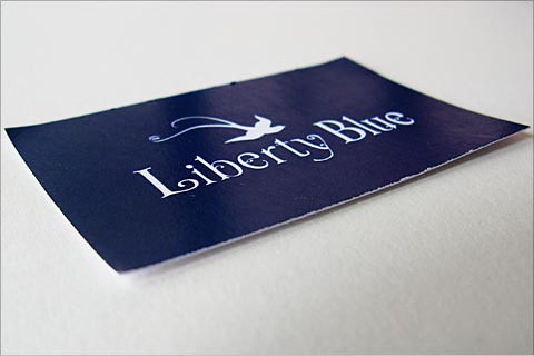 Business Card
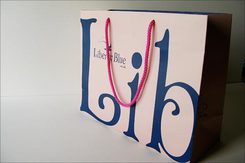 Shopping Bag
My time is limited, my experience in e-commerce even more so. Marc Johns, the illustrator/artist, had done some work for me and I'd visited his shop a few times to see samples. He used Shopify to drive his site. It looked good, the 'Vogue Theme' looked fairly easy to customise. I had a look at the features and it seemed sensible that you give a company a cut of the profits and they keep adding features, do the backups and bug fixes and all I had to do was do the HTML and CSS. I used Shopify's desktop app Vision, to work on the theme, though the 'Liquid' code was a bit of a learning curve. Again the new brand guidelines and a 12 col grid were used for the on-line shop.
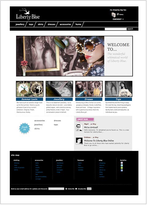 Liberty Blue on-line
It all went live in Spring 2010.