This was a redesign and re-brand for Lap the Lough, a large cycle event in Ireland. The "sportive" market has become pretty crowded in the past 3-4 years. This was to give the event some "stand out" and a base to build on for the next 3-5 years.
I'd been looking at some old record sleeves, not the actual covers…
The idea was to present something different - something that would draw you in, something to set the event apart from similar styled events. We also wanted the site to a look and read a lot snappier, more concise.
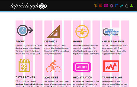
For those that take part each year they basically want to know when it's on, where it starts and how much it's going to cost. Others might want to know how to fundraise and a small bit of background. New comers would want to get a full overview of the event. So the front page had to pack in a lot of information without looking too much like a FAQ page. It had to present all the essential elements for the event in a very easily digestible manner, like a box of chocolates.
I'd been looking at some old record sleeves, not the actual covers but the paper sleeves that used to hold the vinyl. The larger labels would use this to advertise other records you might like - similar to Amazon's "you might like this". These would be laid out in a grid with a small thumbnail of the cover and a bit of copy underneath - sounds familiar? All this 'grid layout' stuff has been around for centuries. So an old Les Baxter LP sleeve of Exotica music was more or less the starting point.
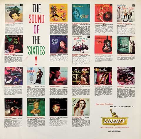 33" vinyl sleeve.
The main layout is on a 888px wide grid producing 12 columns. This gives the option of 2,3,4 & 6 cols when needed.
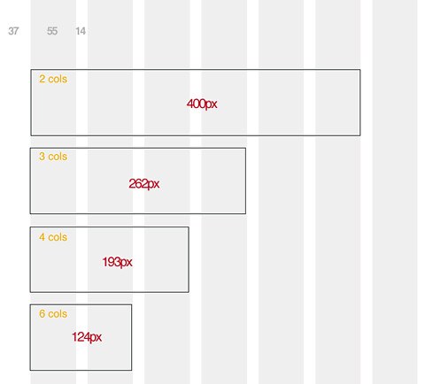 The measures. Page, cols, margins, gutters.
Here's what it looks like with 4 cols of content overlaid on the grid.
 The underlying grid of 888px.
I had a bundle of Drew Wilsons Pictos icons for a while waiting for the opportunity to use them. The idea was to introduce these on the home page like a large chocolate box and then use them as short hand for navigation etc throughout the site. We were also able to use them for the "3 simple…" statements along the top of the page, a quick snap shot/set of instructions of what was on each page.
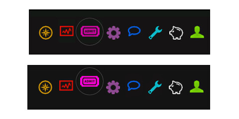
The navigation used the CSS3 opacity setting to save using multiple images for the over/down state. A quick tweak on the padding made it pop up and light up once the page was selected.
The main content is all list driven. One main < div > holds the central content. 4 basic css rules determine how many columns the < ul > content is split into. It all worked fairly simply. Sort of. All built on Expression Engine 2.1.
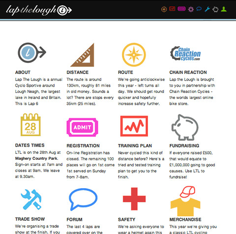
The Home page.
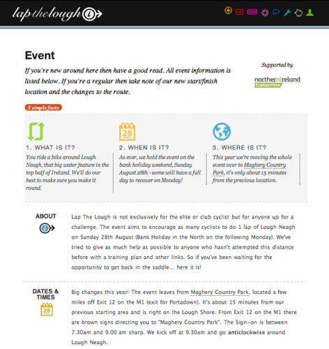
The Event page.